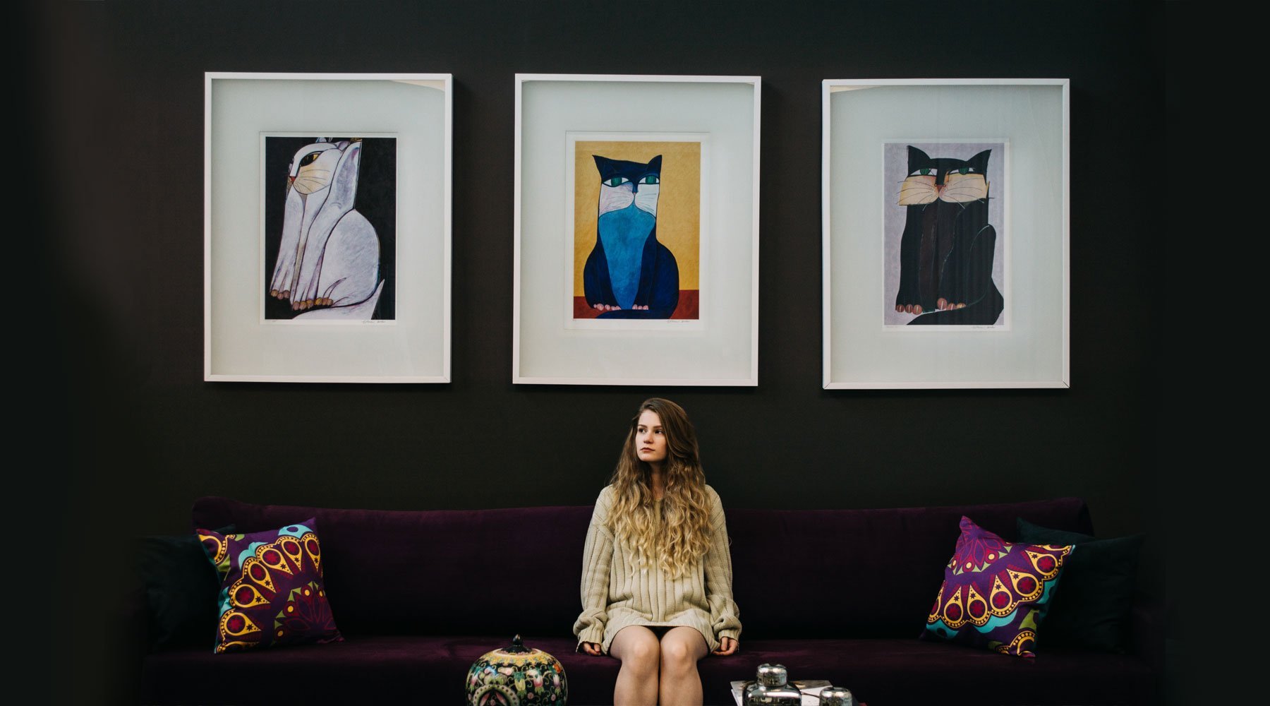
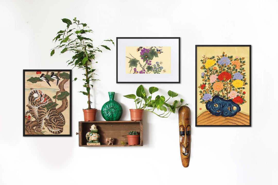
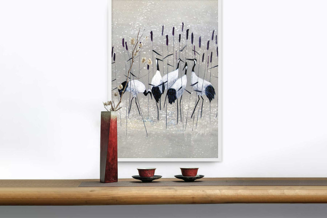
Wandposter, Artworks and photos serve as the stylistic icing on the cake that is your home. Wall posters attract attention, pull the room together and make your home inviting.
Finding and installing pieces you love are worth the effort because they actually improve your home.
While there are no rules for beautifying a home, following these basic instructions will help you choose the perfect pieces. Go by size, style, color, theme, inspiration or floor plan. The possibilities are limitless.
TIP NO. 1 YOU NEED TO CHOOSE THE PERFECT WALL DESIGN
The most important advice every person needs to find the perfect one Wandposter to choose is: choose what you like. If you see something and it does not evoke feelings of enjoyment or relaxation, you should not hang it on the wall. It's your home, your design and your money you spend on wall posters.
While it's common for family members to compromise when making choices, that doesn't mean you need home decor that doesn't fit your style. You live in your home, so enjoy the artwork that adorns your walls!
SELECTION OF WALL POSTERS BY SIZE
When it comes to wall posters, things get tricky if you aren't picky about the size. For quick selection, keep a specific size in mind when searching for wall posters.
Do you want to decorate a room? Many people find it easier to start with the larger works and work your way down. As you start putting your space together, the purchases will add up, and soon your home will be decorated the way you want.
 In the deep - Jiyun Jung (South Korea)
Here are the basics of sizing Wandposter, and whether they will be displayed alone or together in a gallery wall, in case you want to use sizing as your defining characteristic:
Oversized: These pieces are 36 inches long or larger. Before purchasing such a large piece, measure your space to see if it can accommodate it. Oversized wall posters act as a focal point of a wall or room.
Large: The frame of this size is approximately 70 to 90 centimeters long. Large wall poster can serve as a centerpiece or be balanced with mini or small pieces on either side. One or two large pieces per room are standard.
Middle: Wall posters in this category are between 50 and 70 centimeters long. Some pieces can stand alone, but medium pieces usually like to be grouped together. Keep your space symmetrical when you add medium-sized wall hangings.
Klein: A small wall hanging fits well over shelves, furniture and on short walls because it is 35 to 49 centimeters long. Small pieces of art work well in pairs or groups of three to six wall hangings.
Mini: The smallest size of the frames is Mini and ranges from 15 to 34 centimeters. Think of anything the size of a sheet of paper or smaller as a mini work of art. They are often sold as collections; Usually, there are at least three to four pieces that are sold together.
When choosing wall posters, start with a general idea of the size you're looking for in a room. Most bathrooms can't accommodate oversized wall posters, just like most living rooms aren't decorated with minis.
There are some general sizing rules to think about:
- Pictures should be no more than two-thirds longer than your sofa.
- Photos should be at least 15 centimeters above the edge of your furniture.
- A small work of art cannot fill a large space. Group small pieces together. Works by the same artist complement each other well.
- When choosing the size, consider the height of the ceilings. Make sure it fills the space in length and width.

SELECTING WALL POSTERS BY STYLE
 Of all the ways to choose Wandposter To decide, decorating your home in style is perhaps the most natural thing to do. More than anything else, choosing wall posters based on style is personal. Some examples of styles to use include: an emphasis on antique pieces, a bright, bold shape, or a bohemian look.
A secret trick is to choose a fashion designer you like and mimic your home based on that designer's clothing style. Is your house a Levi House or a Ralph Lauren?
Make your decisions based on what you like after applying certain parameters like size or color scheme. Don't know where to start? Try to find a piece for each of the following categories:
- Choose pieces that match the style of your room, including furniture you already own or items you have accumulated over time.
- Invest in at least one significant or oversized piece that you would like to see in the years to come.
- Buy a set, a trio, and even a group of mini or small pieces. These fit great over windows or on short walls.
- Use frames to emphasize your style, whether through matching or mismatching ones.
- Mix up materials by adding wood art or a metal sign to the room.
- Add a sign with words, but no more than two or three, that you can swap out.
SELECTION OF WALL POSTERS BY COLOR
 Did you know that in the world of decoration there is a big difference between the color palettes of rooms and the color palettes of art? When it comes to art, there's more scope for using bold color schemes or the brightness you can reserve just for an accent wall.
There are two main approaches to choosing your wall poster by color.
First, include art in your space that incorporates colors already present in the room. In most cases, sticking to a unified schema is coherent, sophisticated and complementary. The basics of this style include:
- Your most significant piece of art should have a background color that matches your wall color.
- When choosing complementary colors, use the color wheel as a guide.
- Use the same color but in different shades. A light blue and white painting looks beautiful with a navy blue wall.
- Only choose a mural if that exact color is already in your room. Most rooms should have no more than four colors to look pulled together.
- Stick to black and white tones if you have any doubts about color. Black and white go with everything while adding to the elegance of a structure.
- Stay away from bright colors and neon colors as they don't always match neutral wall colors.
- Keep the colors in your wall poster consistent in relation to their presence in the room. For example, if your room is black and white with red pillows, choose a wall poster that is black and white with a touch of red.
- Use mirrors to reflect the art. Reflections make the room appear larger and double everyone's appearance Wandposter.
Alternatively, you can choose artwork for your space that introduces bolder tones on the same color scheme. Your wall color does not limit your color palette, but rather serves as a foundation for your evolving personal style.
- Bright or neon-colored artwork stands out against walls with neutral backgrounds.
- Connect the space with lines or style rather than color. Pieces from the same artist can have different colors but are drawn together with the painting style.
- Play with texture and color in wall posters, furniture and accessories. Buy pieces made from mixed materials such as wood and metal. Add the colors of the artwork to your room's accessories to enhance the boldness of your wall hangings.
- Buy based on undertones. The undertones of a painting are the underlying qualities of the image. Dark brown undertones look great on light brown walls, even if light brown doesn't actually appear in the artwork.
- Use photo frames to highlight your favorite pieces. The frames don't necessarily have to be in standard colors like black, white, silver or gold.
- Bring a new color into the room with two or three people. A bright pink might appear by chance, but two circumstances make it intentional. The repetition of a color enhances its effect in the room.

SELECTION OF WALL POSTERS BY THEME
 Did you build your house based on a specific theme or idea? Even if you didn't start with that intention, many buyers, albeit unconsciously, select items based on a theme.
For example, a home with a beachy vibe will have light or light-colored walls, artwork of marine life, pieces of driftwood, and more.
Homes with a theme are easy to decorate because you can quickly weed out items that don't fit your theme.
If you're in a store that sells home goods, simply scan the room for pieces that match the theme. You should also pick up pieces on vacation, with family or friends, or even in unexpected places like garage sales.
Homeowners who patiently keep a concept like the beach in mind while decorating can save money by focusing their attention in one direction.
SELECTING WALL POSTERS BASED ON A PIECE OF INSPIRATION
 Similar to a design centered around a theme, an inspiration piece drives all of your other purchasing decisions. A piece of inspiration for a room could be a piece of art, a sofa you love, or even just a piece of jewelry with a meaning that you like. One woman's antique paperweight is another woman's grand piano - both potentially inspiring the design of an entire room or even an entire home.
Once you've found an inspiration piece, follow these tips for choosing Murals:
Use your inspiration piece to determine your room's color scheme. It's best to narrow it down to three or four colors. When you focus on a specific scheme, it's easy to find inspiration.
Choose one Mural, which follows the color scheme of the room. With a specific color scheme you can combine patterns, geometries, solids and much more. Typically, when introducing a new color, you need to add it in at least two places to create a cohesive space.
Trust your natural instincts; Art doesn't have to be perfectly coordinated to create a beautiful space. Surround yourself with things you love.
Don't forget a touch of white. The room cannot be covered with paint, otherwise the eye will not get a break from all your design.
SELECTING WALL POSTERS FOR AN OPEN FLOOR PLAN
As more homeowners purchase or design open floor spaces, choosing wall posters is more difficult than ever. The most important rule to follow when choosing wall posters for an open floor plan is to purchase and hang them with the purpose of clearly defining the space.
Create a cohesive look between rooms, but place your wall posters firmly in one room. For example, a wall shared between a kitchen and a living room should have a wall poster specifically in the kitchen and then the living room.
If you Wandposter For choosing an open floor plan, you need to consider the space and its use. For example, if your dining room opens to the living room, you may not want to have traditional food-focused artwork hanging in that room.
WALL POSTER DEFINES YOUR HOME
The right wall poster sets the tone for your space, makes it inviting, conveys what kind of family you are and defines different spaces.
Whether you focus on color, size, a theme, or even an inspiration piece, choosing your wall poster doesn't have to be difficult.
You deserve a home that is comfortable but also fits your sense of style. Have fun choosing your wall poster. A cohesive home full of aesthetically pleasing Artworks is in your future.
Create Here your own picture wall for your home artlia.de!


